Computer Museum Redesign
- summer 2021
- HTML
- SASS
- 11ty
A redesign of a local museum's website aimed at solving established user and design problems. The project involved a heuristic evaluation, pseudo stake-holder meetings, high level and low level priority guides, wireframes, mockups, and a website fully developed using HTML and SASS in conjunction with 11ty and Liquid.
background
To start off this project, students were paired up and given either 'stakeholder' and 'designer' roles to mimic the process of fulfilling goals set by a stakeholder or client. The 'stakeholder' performed a heuristic evaluation, analysing every aspect of the site to be redesigned and establishing the user as well as business goals to be addressed, which was then handed off to the 'designer' who came up with possible solutions.
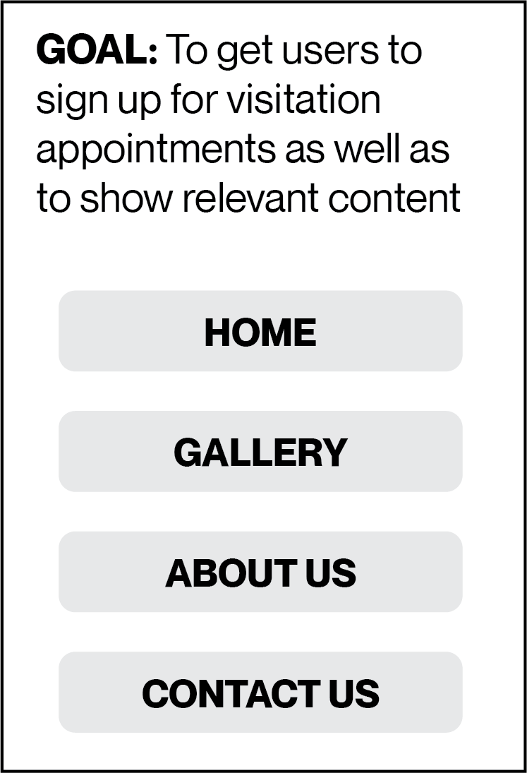
The established user goals were as follows:
- Make an appointment.
- Get information about the museum such as address and open hours.
- Look at museum contents.
The established business goals were as follows:
- Market and advertise the museum.
- Get users interested and signed up for the museum newsletter.
- Get users to sign up for museum visit appointments.
problems
A notable issue with the original site was that the site navigation would change between pages. Another issue was that the user had to either re-enter the url or use the browser's previous page button to reach the home page. Site content was also split into many different categories which simply led to being lost on the site.
Overall, the site suffered from inconsistent navigation, disorganized information architecture, and lack of content hierarchy.
High Level Priority Guide
In line with the established user and business goals as well as the identified problems, I created a high level priority guide and sorted the topics from greatest importance to least.
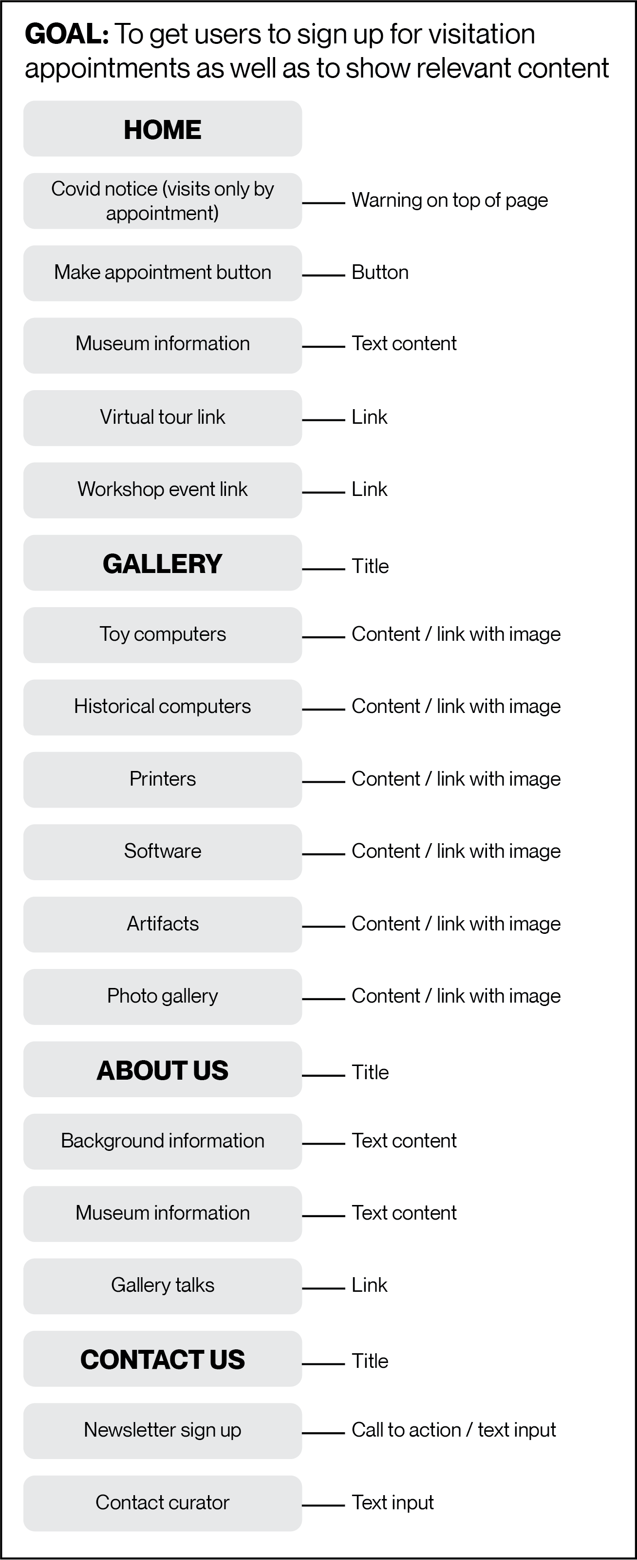
Detailed Priority Guide
I then organized the remaining site content into a detailed priority guide.
Wireframe
Mobile wireframe made in Adobe Xd.
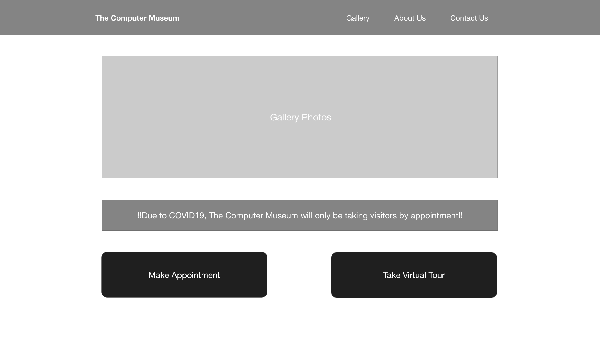
Web wireframe made in Adobe Xd.
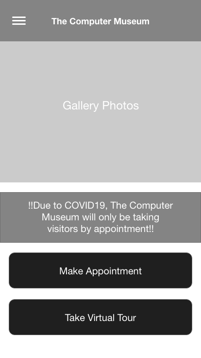
Mock up
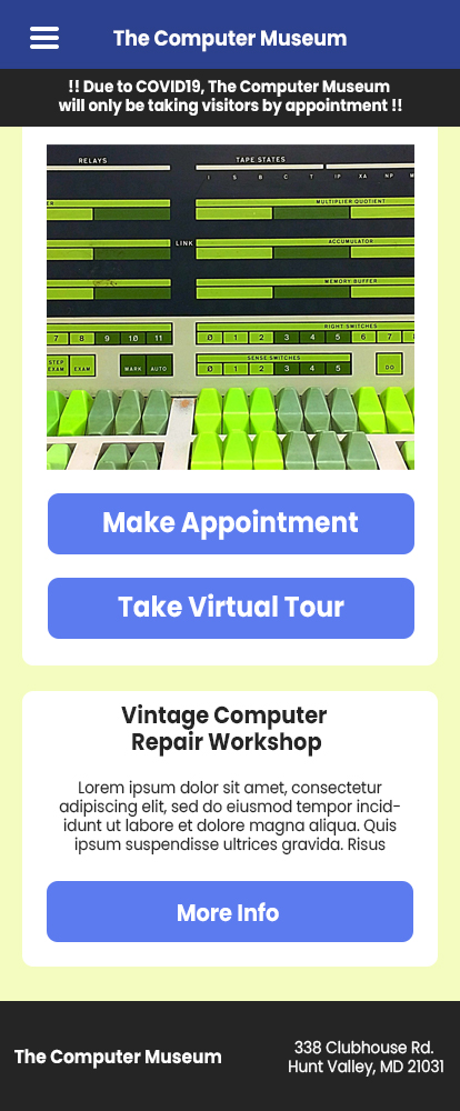
Mobile mock up made in Adobe Illustrator.
Web mock up made in Adobe Illustrator.
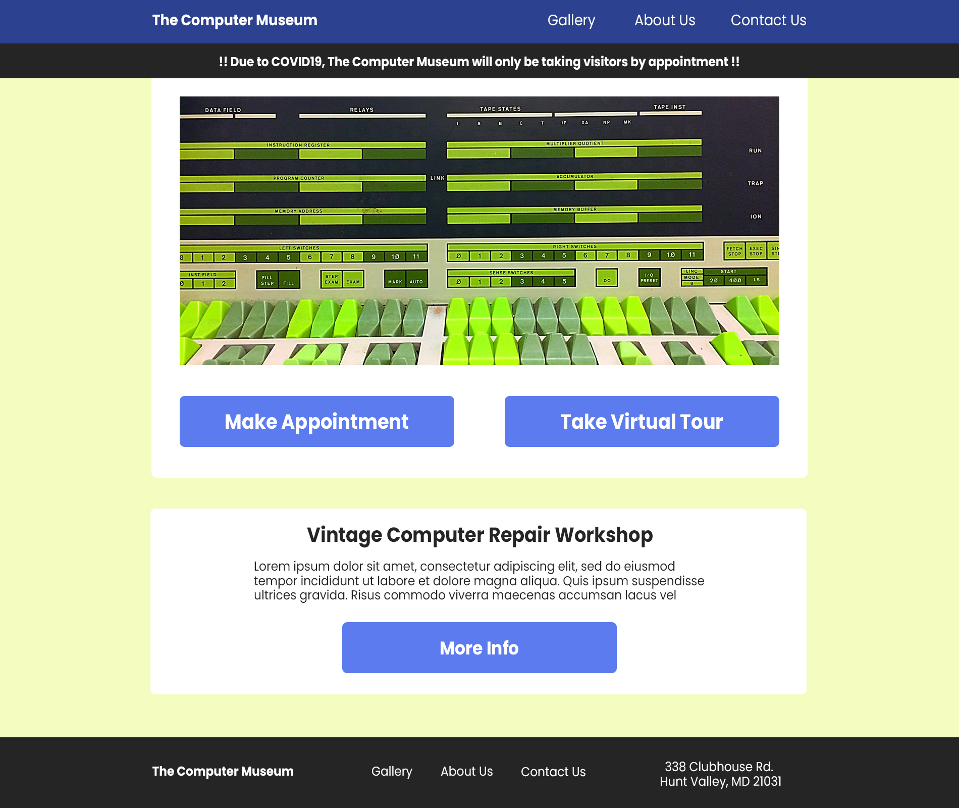
First Developed Site
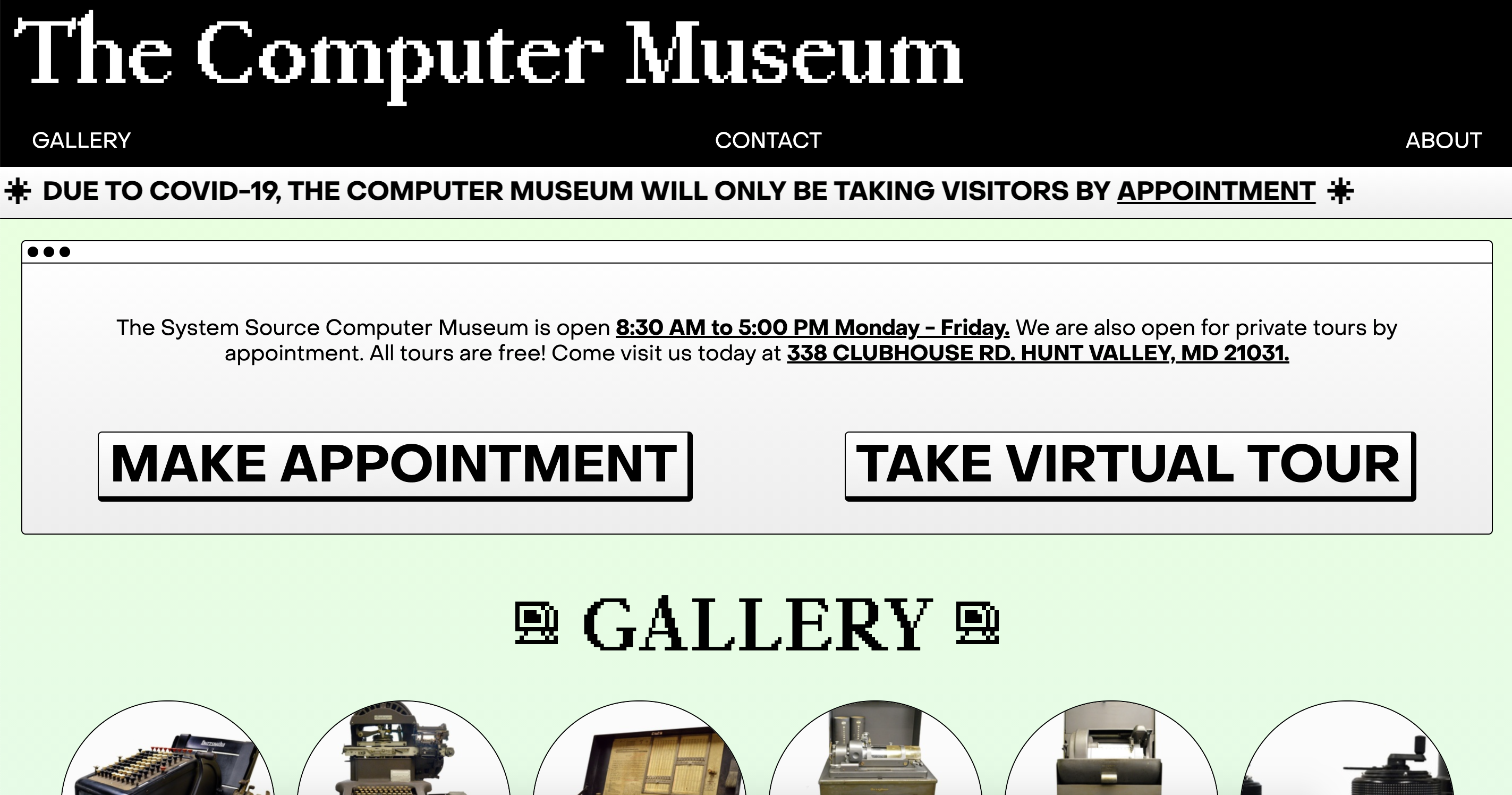
The final aspect of this project was to develop the site in 11ty using HTML and SASS. I also utilized Glitch to facilitate more efficient commenting and site sharing. Unsatisfied with the original color scheme, I opted to go for a more computer related aesthetic.
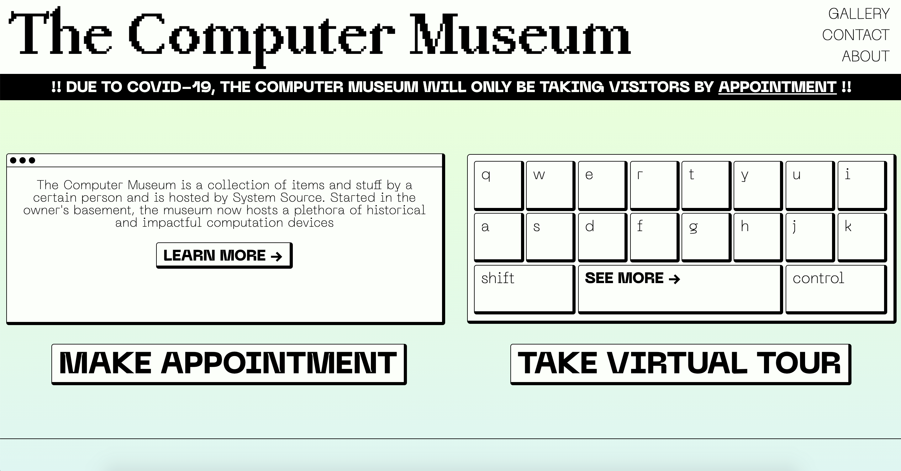
Home page with appointment and tour buttons.
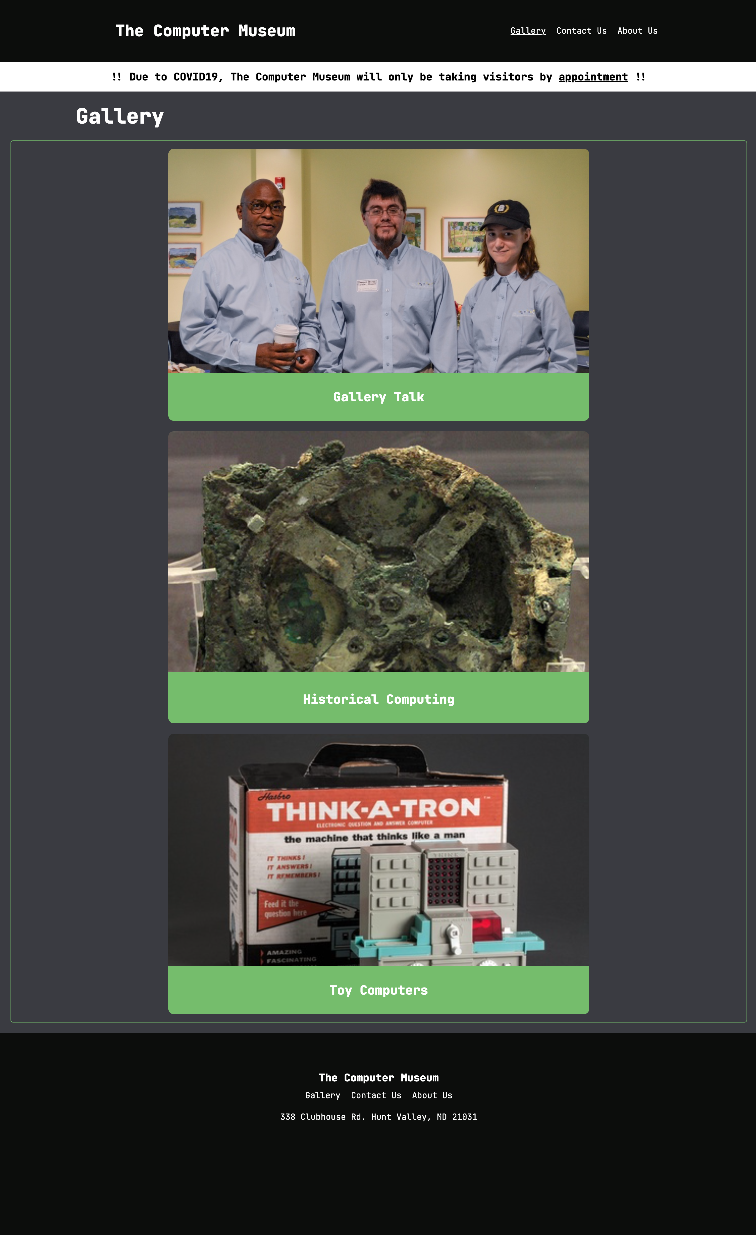
Gallery page with different categories.
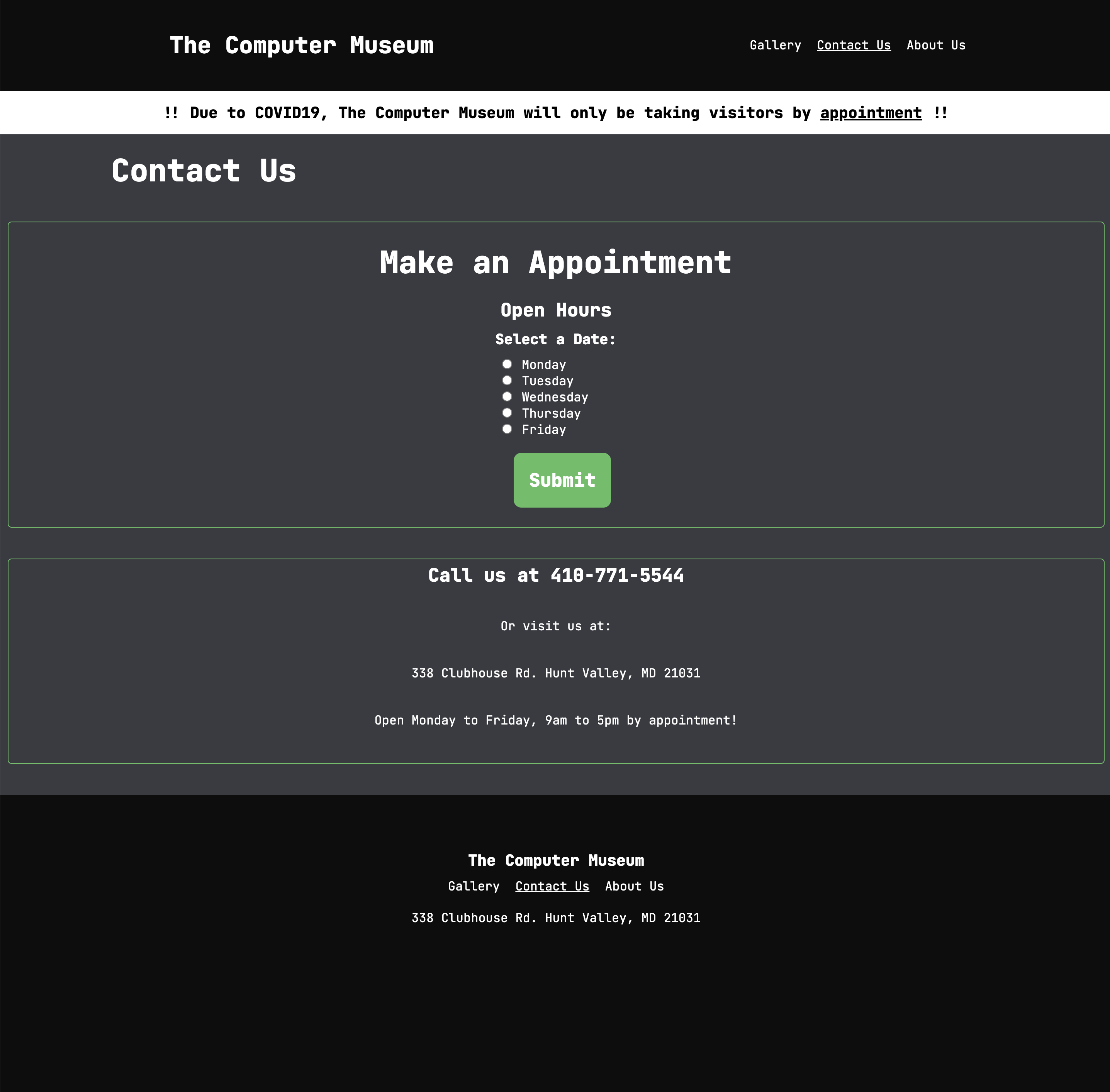
Contact page with appointment selection.
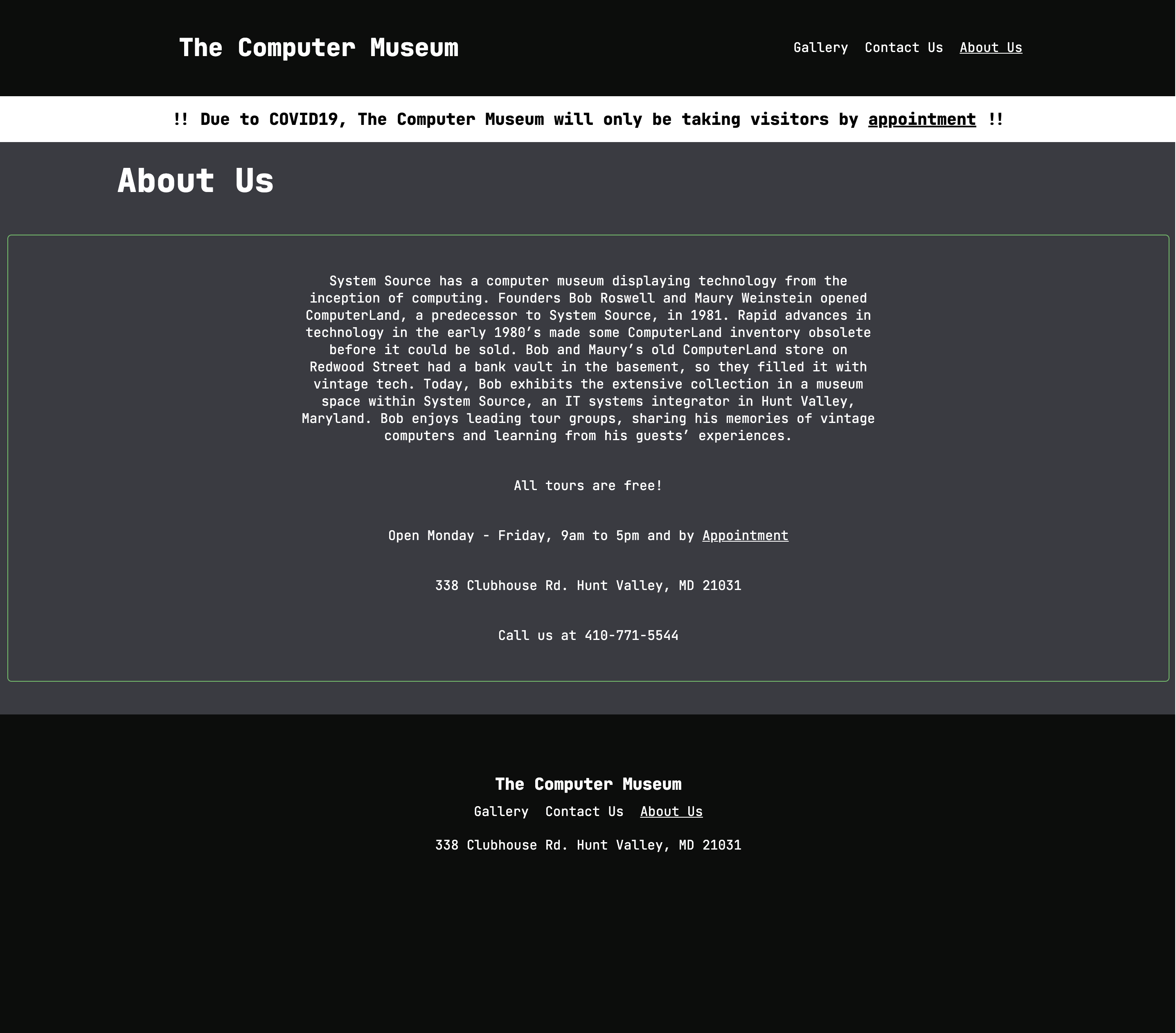
About page with relevant information.
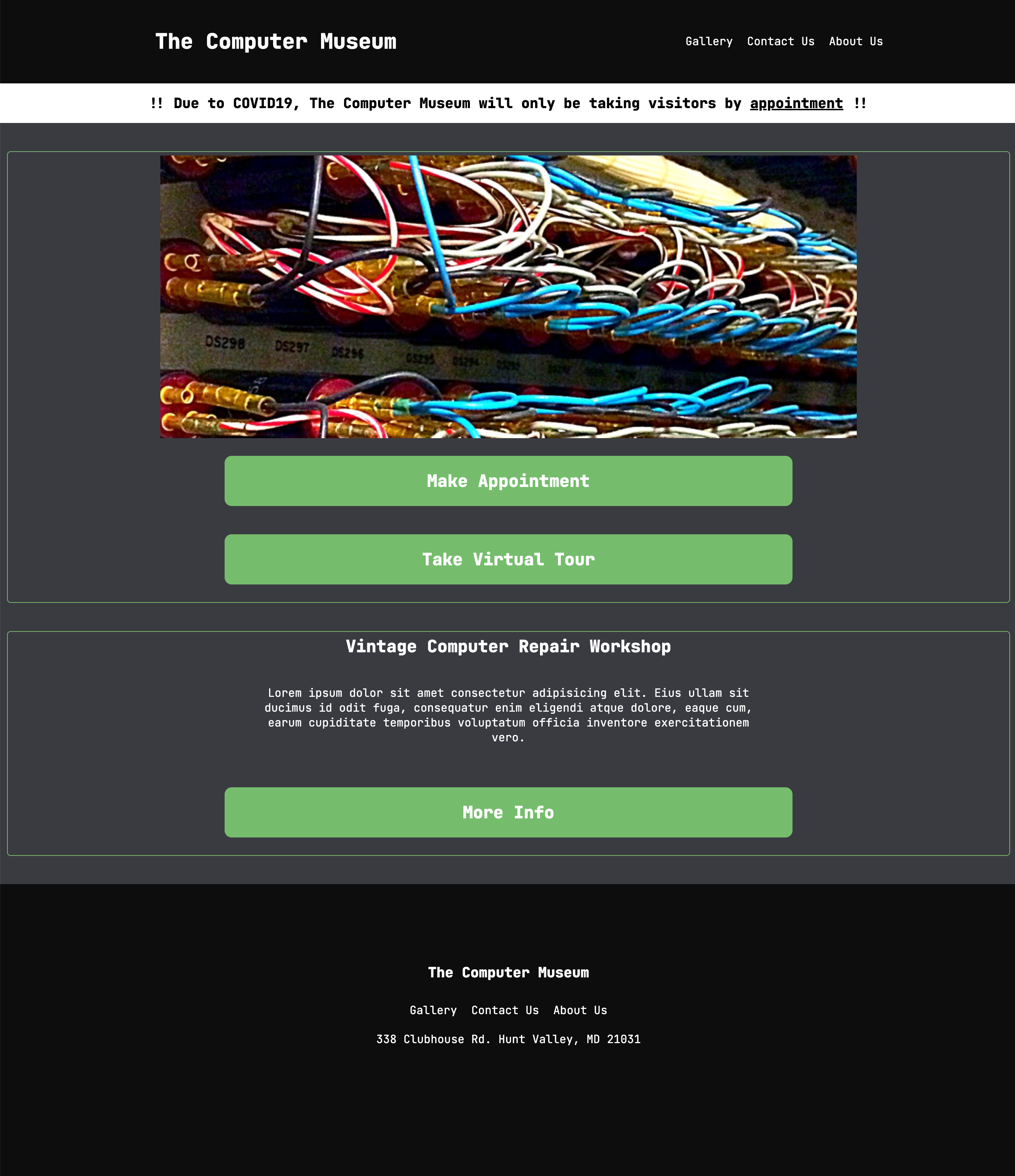
Revised Prototype
I decided to revisit this project after I finished the semester. I had felt that even though my final result was more concise than the original website, there was still a lot left to be desired, both in terms of aesthetics and in its overall user experience.
I wanted the user to be able to experience all of the museum's content without any site navigation besides scrolling and so I opted for a single page layout. I had the idea to create a nifty keyboard interaction that would lead the user to the gallery items but I scrapped it in favor of a more straight forward approach.
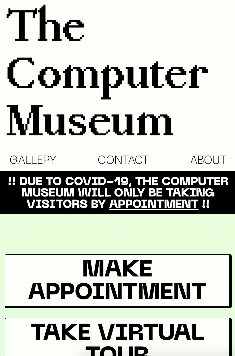
Prototype for mobile screen size.
Prototype for web screen size.
The final site was created using HTML and SASS with 11ty, however this time without the use of glitch. The gallery and its contents were created using pagination within 11ty. This site has a bigger emphasis on the warning, appointment button, and virtual tour button than the previous version, and makes sure to put the museum information front and center.