Canvas Redesign
- summer 2021
- HTML
- SASS
- 11ty
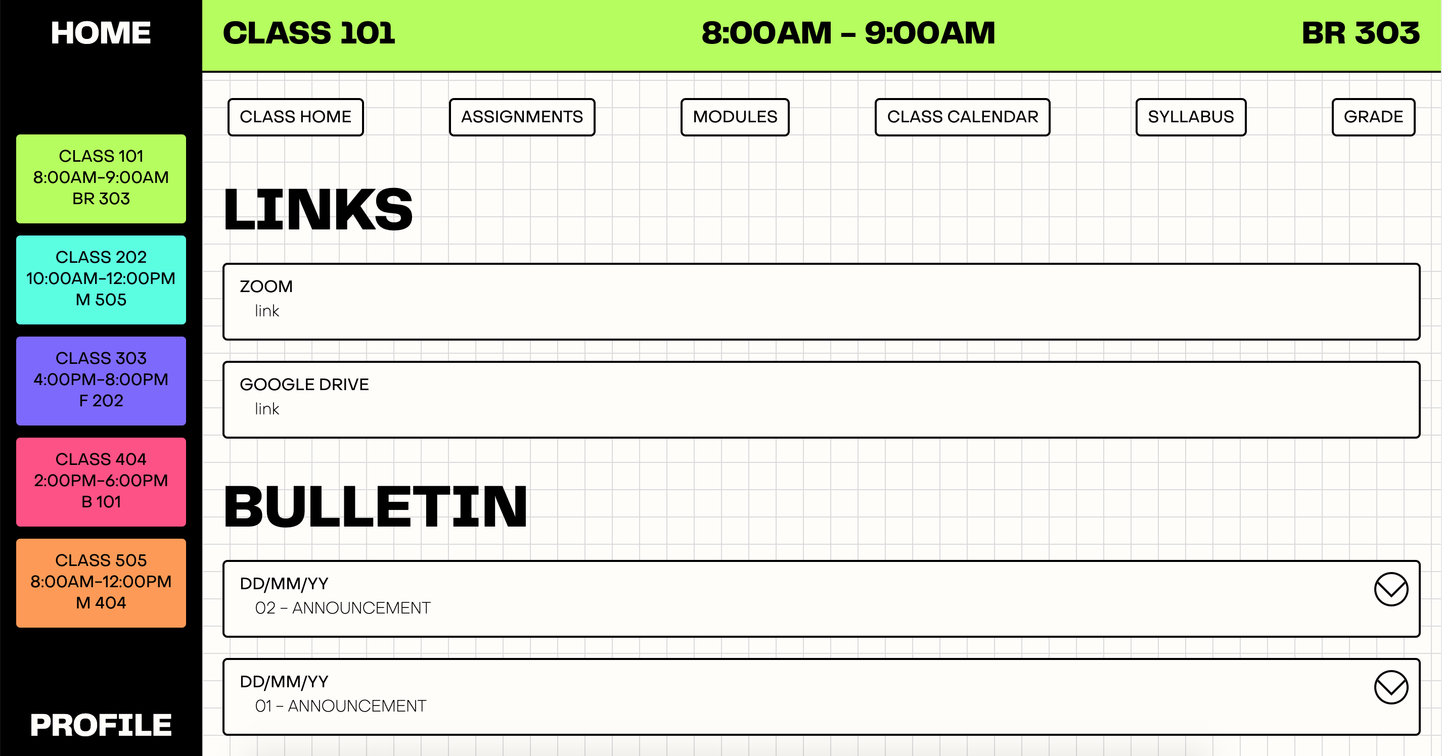
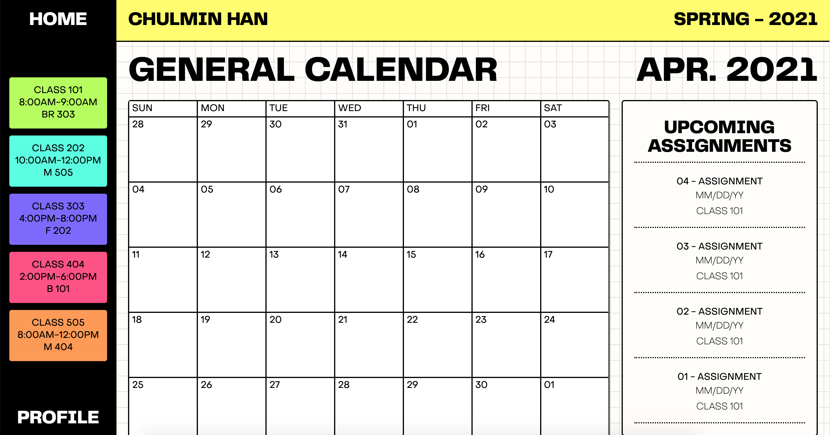
A redesign of a learning management system aimed at restructuring information architecture and overall user flow. The project involved creating personas, establishing problems through interviews, finding solutions through card sorting, testing said solutions through tree testing, wireframes, and a website fully developed using HTML and SASS in conjunction with 11ty and Liquid.
Problems
Through 5 interviews with students using Canvas (in fall of 2020), I boiled down the main problems with the current system to 3 main items:
- Disorganized and varying organization structures between classes.
- Too many options to click through in order to reach destination.
- Too much time spent on adjusting and figuring out each class site structure.
Persona
I then created a persona to consolidate the users' and interviewees' perspectives.
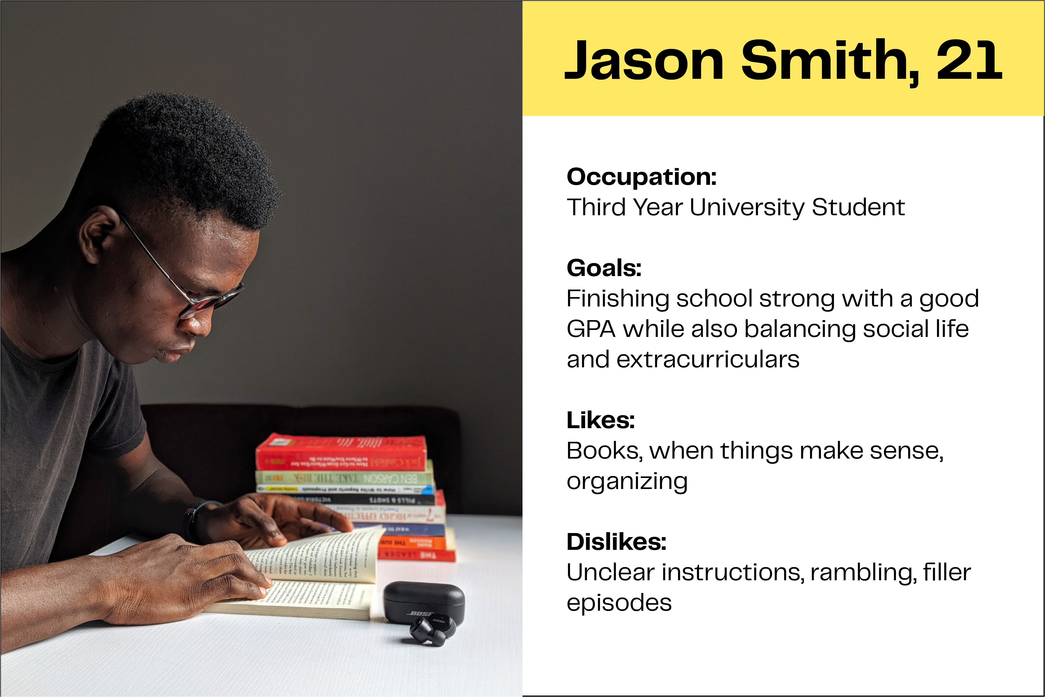
Persona created in Illustrator.
Goals
I decided to focus on 3 main ideas in order to create a learning management system that can aid students' work-flow while also allowing instructors to setup their classes intuitively and with similar organization structures:
- Pare down the current hierarchy to the bare essentials.
- Consistent organization between classes for both students and instructors.
- Intuitive and efficient use in order to maintain workflow without interruption.
Site Map 1
After running card sorting with the same interviewees, the first hierarchical solution that I came up with split the content into three main categories:
- Agenda
- Class Information
- Profile
The 'agenda' category presents relevant class information in a meaningful way in order to aid students' workflow. The 'class information' category is for class-specific course work as well as grades, while the 'profile' category serves as an overall settings, preferences, and class history.
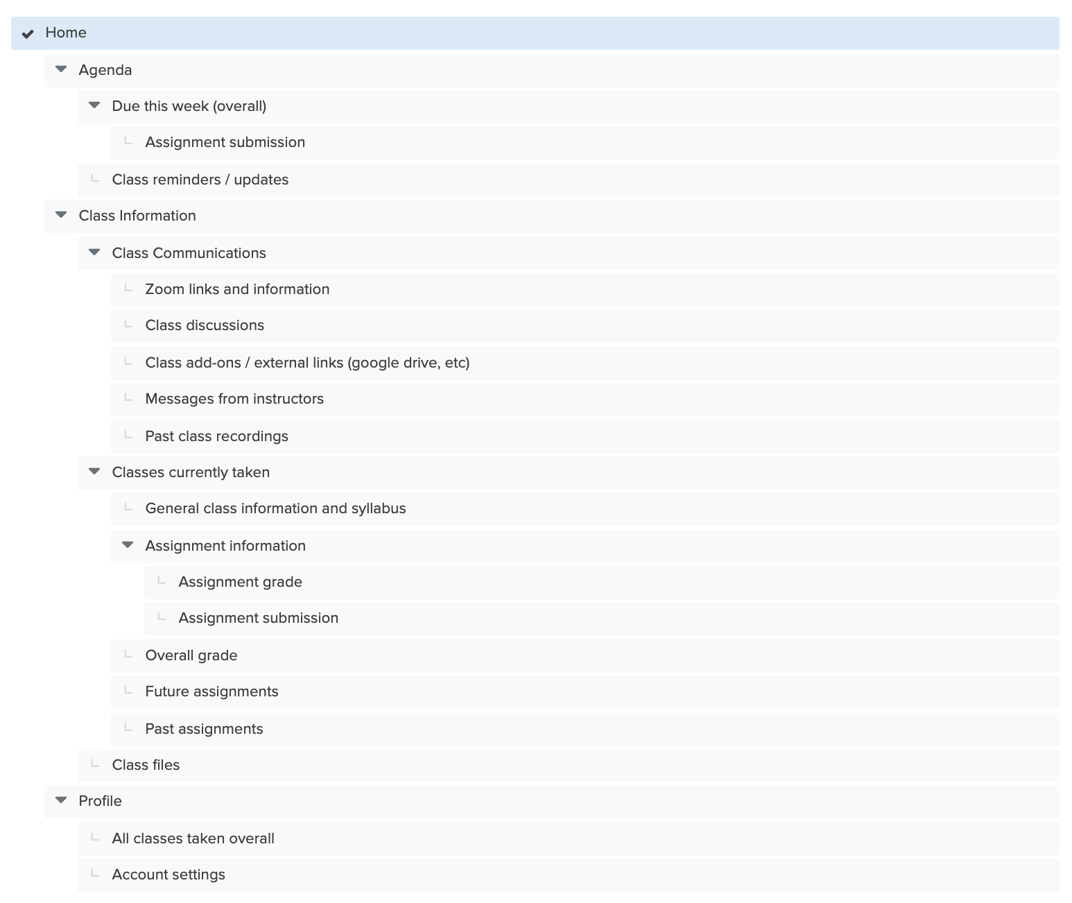
First site map made in optimal workshop.
Site Map 2
After tree testing 5 scenarios involving the same interviewees, I decided to further reduce the 'class information' options because there seemed to be confusion as to where certain items were located. Only 6 categories remained within 'class information':
- Class Home
- Assignments
- Modules
- Class Calendar
- Syllabus
- Grade
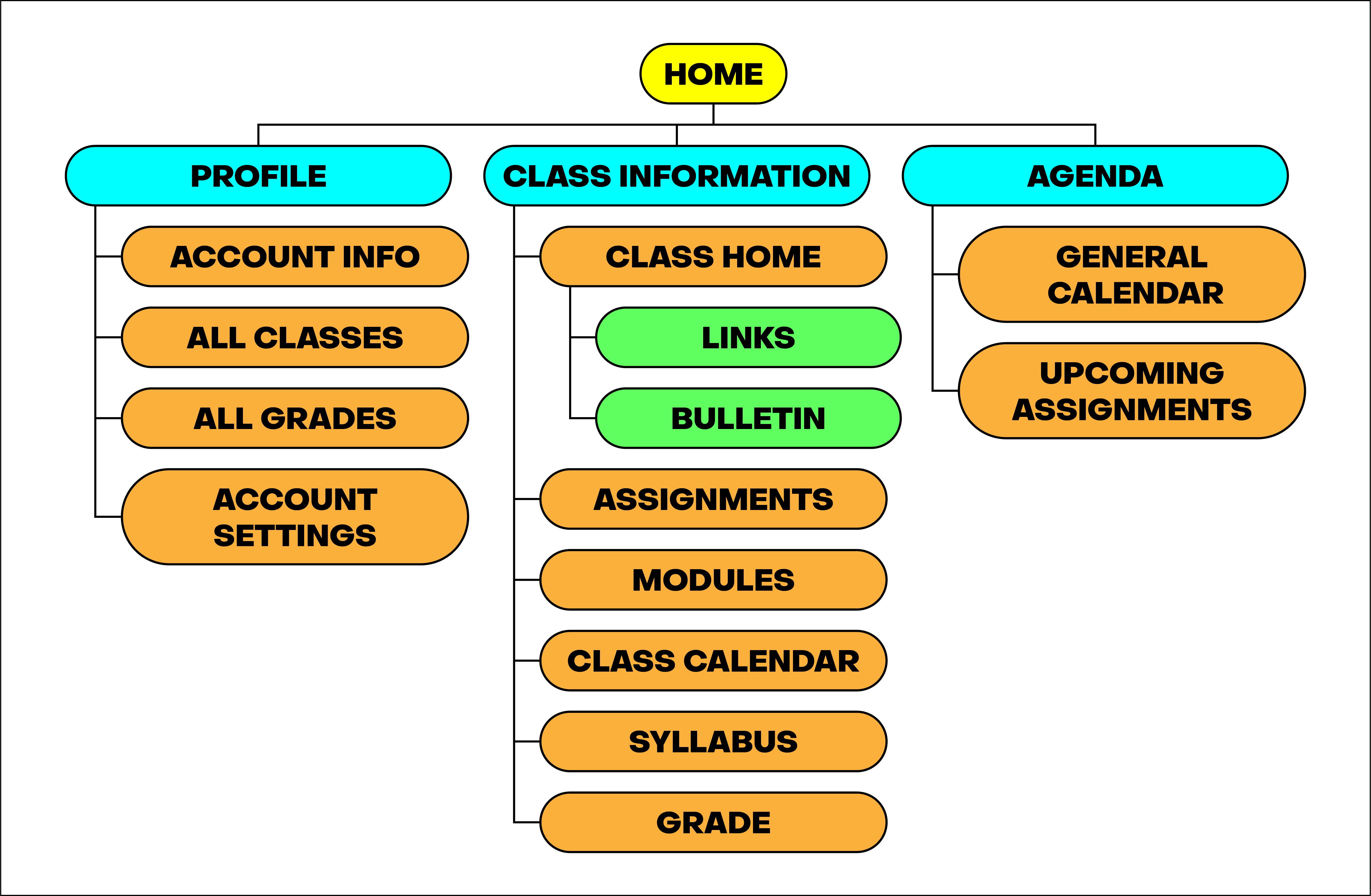
Second site map made in Adobe Illustrator.
Wireframe
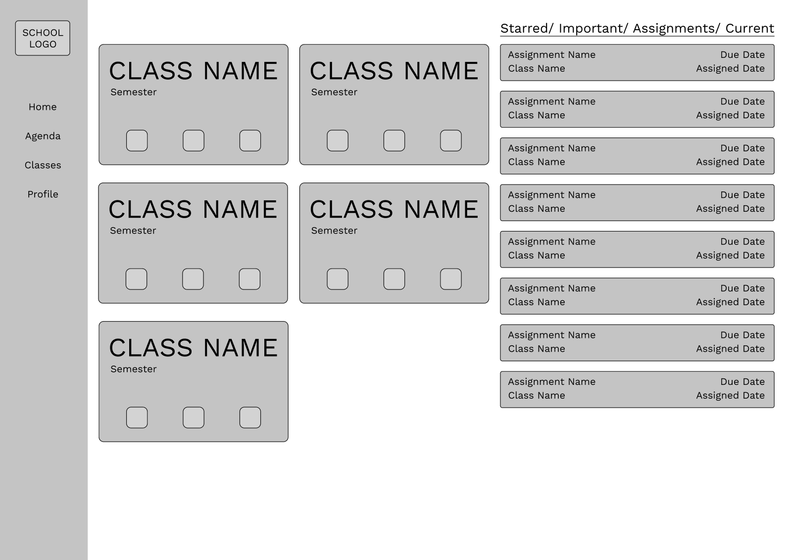
Web wireframe made in Figma.
Low Fidelity Prototype
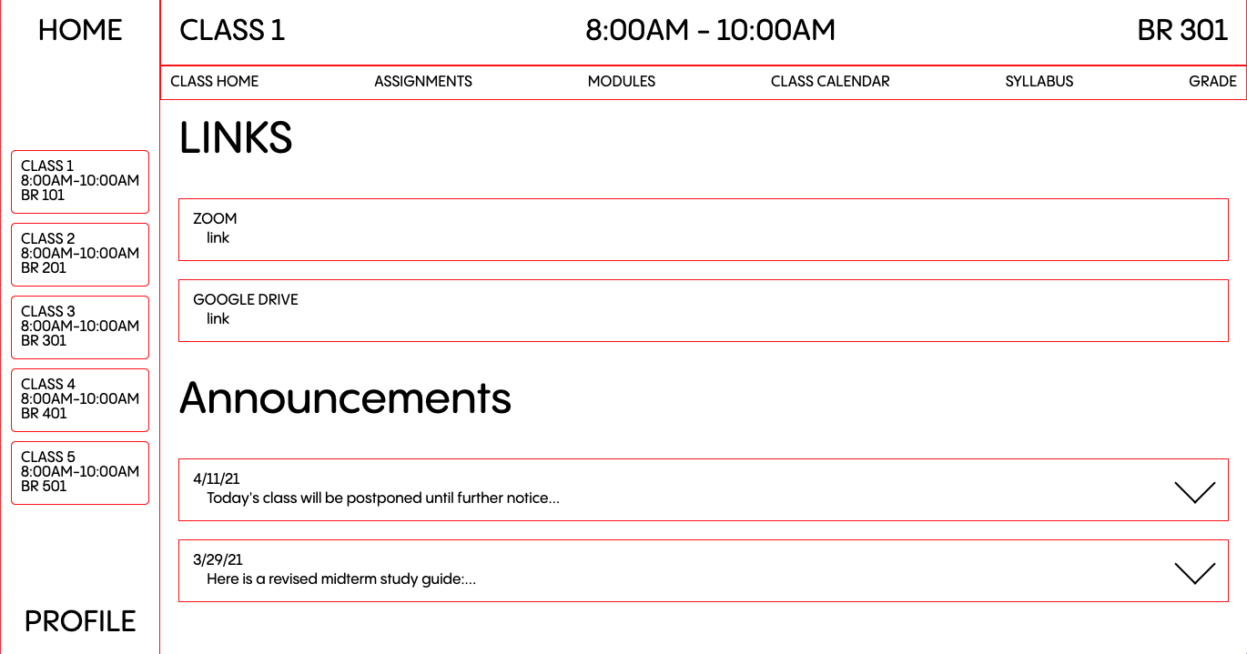
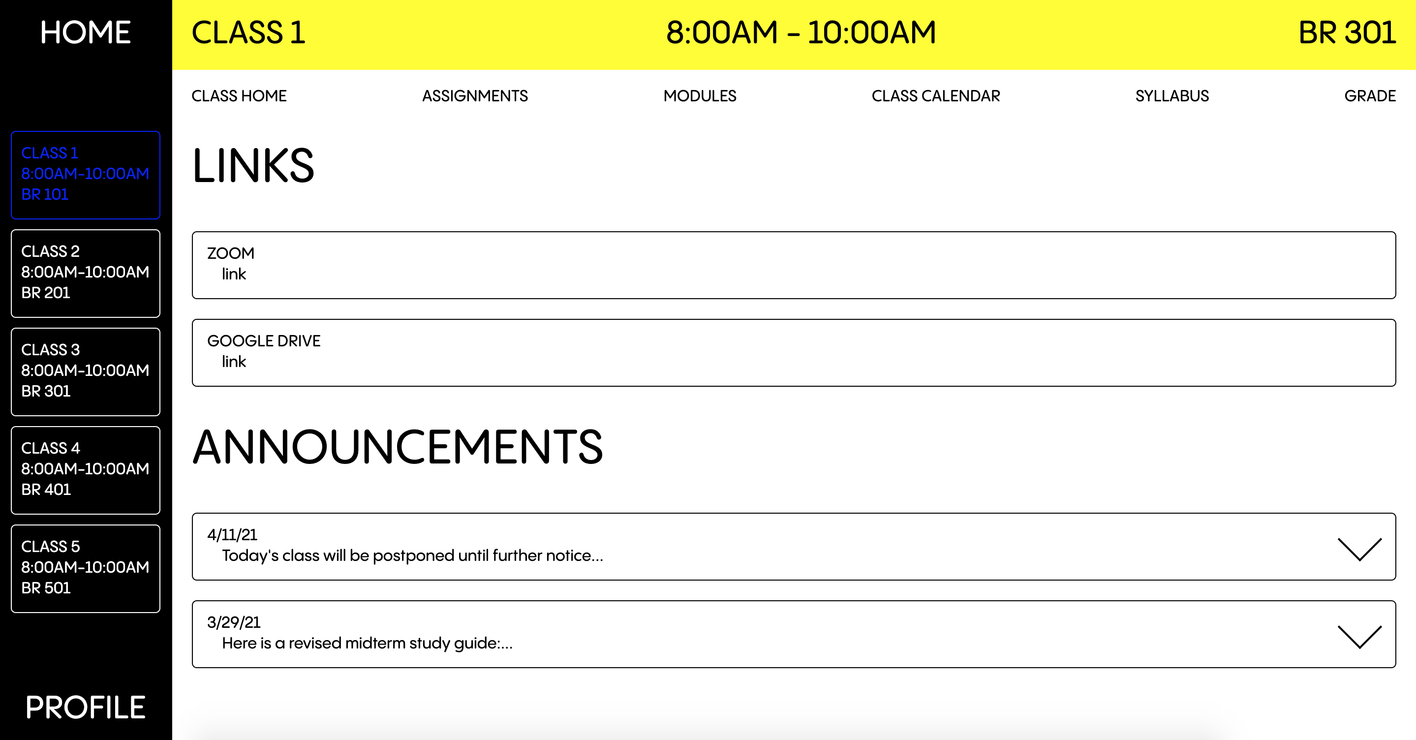
The final site was created using HTML and SASS with 11ty. Essentially functioning as a high fidelity prototype, the site demonstrates how the more straightforward organization scheme can aid in maintaining workflow while also being clear and concise in the information it provides.
